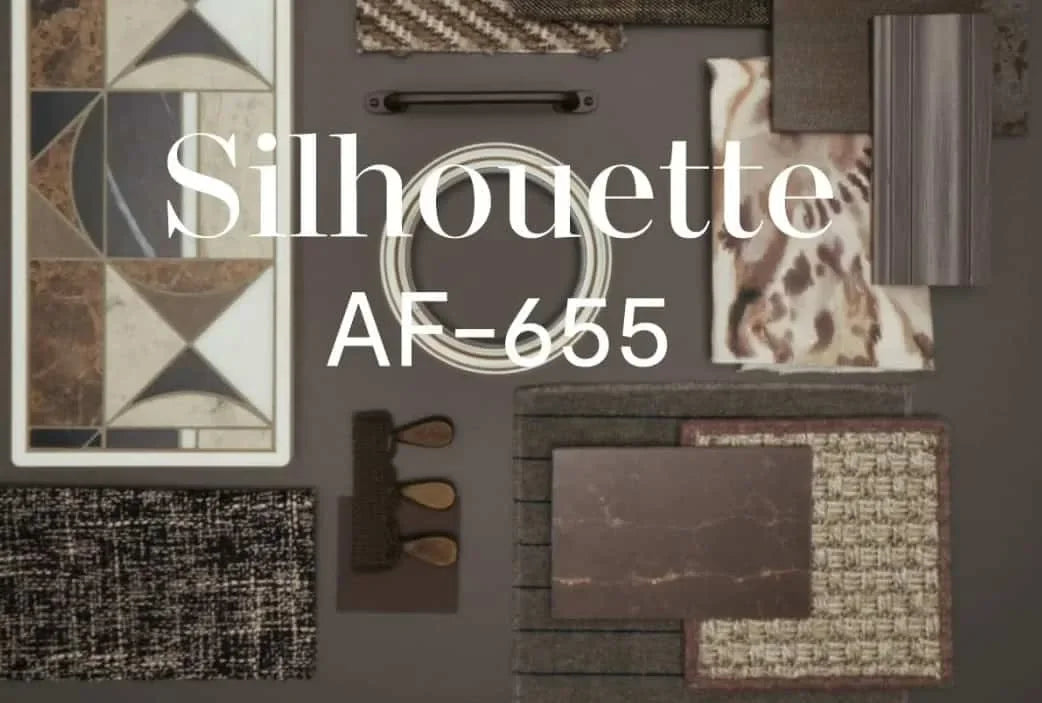
Seeking a fresh start for your home in 2026? Benjamin Moore’s Silhouette, the newly crowned Color of the Year, offers a timelessly versatile foundation for creating an inspired color palette. This sophisticated neutral redefines understated elegance, making it easier to achieve inviting, artful spaces that feel current without ever chasing trends.
Introducing Silhouette: A New Standard in Color Palette Foundations
Benjamin Moore’s Silhouette is not your average neutral. Landing somewhere between charcoal and soft brown, it’s a warm, alluring shade with the depth to transform a room’s atmosphere. Unlike sterile grays or stark whites, Silhouette’s richness brings subtle drama while preserving comfort. Homeowners and design enthusiasts alike are already exploring how this color can become their go-to base for a versatile color palette.
• Silhouette’s inviting undertones adapt gracefully to changing light, working harmoniously with a range of styles.
• It offers a perfect backdrop for accent colors, artwork, and textures, letting other design elements shine.
• The color exudes a sense of calm confidence, offering both modernity and classic appeal.
In 2026, Silhouette is poised to anchor countless color palettes, acting as a bridge between evolving design sensibilities and the timeless need for cozy, livable interiors.

What Makes Silhouette the Ideal Backbone for a Color Palette?
Selecting a foundational shade for your color palette is one of the most important steps in the design process. Silhouette was named Color of the Year for its extraordinary flexibility and ability to interact with a variety of complementary hues. But what exactly makes it so unique?
- Rich Neutrality: Unlike cool grays or beige tones, Silhouette’s warmth never feels cold or industrial.
- Balanced Undertones: It contains hints of brown and gray, which means it pairs easily with both warm and cool accent colors.
- Adaptability: This shade looks refined in living rooms, bedrooms, kitchens, and even exteriors, meaning it can unify an entire home’s palette.
- Mood-setting: Silhouette creates cozy nooks and relaxing retreats, while still allowing for sophisticated, urban energy in open-plan spaces.
Whether you’re starting from scratch or updating your color palette, Silhouette’s rich neutrality enables creativity while maintaining cohesion from room to room.
The Story Behind Silhouette: Reflecting Lifestyle and Design Trends
The choice of Color of the Year isn’t random. It’s the result of extensive trend forecasting, analysis of emerging design directions, and deep understanding of how people live. In recent years, there’s been a shift back to comfort, artisanal textures, and a desire for restful, layered color palettes that feel nurturing rather than stark.
Silhouette emerged as a reflection of these shifts:
- Wellness-Driven Spaces: Colors that support relaxation, mindfulness, and well-being are in demand.
- Mixed Materials & Textures: Layering this color with tactile materials—like velvet, linen, or wood—brings its undertones to life.
- Heritage Meets Modernity: The shade works in both traditional and contemporary settings, easing the contrast between old and new.
As a result, Silhouette doesn’t just keep up with trends—it provides a serene anchor as your style evolves, making it the perfect cornerstone for anyone curating a flexible color palette.
Building a Cohesive Color Palette with Silhouette
A successful color palette fuses colors that complement each other and reflect your lifestyle. Starting with Silhouette, you can craft harmonious schemes that feel both unified and expressive. Below are practical tips to guide your process:
- Choose Primary Accents: Pair Silhouette with sage green, muted blush, or creamy ivory for a nature-inspired palette. Jewel tones like sapphire or deep burgundy add richness for bolder tastes.
- Play with Contrasts: Use crisp whites or vivid blues to create dynamic edges and define architectural features against Silhouette’s soft depth.
- Layer in Texture: Think beyond paint—add wools, wood grains, metals, or glass to bring multidimensionality to your spaces.
- Opt for Flexibility: Start with Silhouette on major walls or large furnishings, then rotate more colorful accents seasonally.
By anchoring your color palette around Silhouette, you gain the freedom to evolve your interiors while maintaining overall harmony.

Silhouette in Different Spaces: Room-by-Room Applications
How does Silhouette perform across different rooms? Here’s how you can leverage its strengths for every part of your home:
Living Room
In the heart of your home, Silhouette imparts a welcoming, grounded feel. Pair it with plush textiles and natural woods for a cozy retreat, or accent with metallic fixtures for sophistication. Add artwork in lighter or more saturated colors to create dynamic focal points without overwhelming the underlying palette.
Bedroom
Silhouette’s enveloping warmth encourages restful sleep. Combine it with linens in pale neutral tones, or pops of olive green and muted rose to strike a balance between serenity and interest. Soft area rugs, velvet throws, and subtle lighting further enhance the room’s calming atmosphere.
Kitchen
For those redesigning their kitchens in 2026, Silhouette makes a stylish alternative to white or trendy navy cabinetry. Use it on lower cabinets or as a backsplash backdrop, paired with marble, brass, or natural stone for a modern but timeless look. Surround it with creamy whites and gentle greens for a palette that feels both fresh and enduring.
Bathroom
Silhouette lends a spa-like quality to bathrooms, enveloping the space in tranquility. Complement the color with stone tiles, matte black hardware, or woven baskets to bring visual interest. Light-reflective surfaces and soft accent colors—like powder blue or taupe—help create a balanced, serene retreat.
Entryway and Hallways
First impressions matter, and Silhouette sets a tone of understated luxury at your threshold. It’s forgiving on high-traffic walls and camouflages everyday smudges or wear. Pair with minimal art, simple runners, and practical storage in light wood tones for an inviting transition between public and private rooms.
Choosing Accents: Expanding Your Color Palette with Silhouette
While Silhouette provides a strong base, building out your full color palette is essential. Consider these categories for accent colors:
- Nature-Inspired Tones: Try olive, fern green, or dusky lavender for a restful, biophilic effect.
- Warm Metals: Accents in brass, copper, or gold enrich Silhouette’s warmth.
- Clean Whites and Creams: For a modern, breezy look, which keeps spaces from feeling too heavy.
- Bold Pops: Deep teal, plum, or ochre injects vibrance and stops the palette from becoming too safe.
Aim to balance no more than three strong colors in most spaces. This ensures your palette is cohesive, approachable, and easy to update with evolving tastes.
Lighting Matters: How Silhouette Adapts
Light quality impacts how you perceive every color in your palette. Silhouette’s unique undertones make it particularly responsive to shifts in lighting.
- Natural Daylight: Here, Silhouette reveals its full complexity, ranging from warm taupe in morning light to nuanced gray as dusk arrives.
- Artificial Light: Under soft white bulbs, it leans cozier; in cooler LED light, its subtle brown side emerges.
- Directional Shadows: In rooms with pockets of shade, Silhouette develops dramatic, enveloping corners—perfect for creating reading nooks or accent areas.
Test Silhouette on walls in different lighting at home before finalizing your palette to ensure your color selections highlight the shade’s full beauty.

The Psychological Impact: How a Color Palette Shapes Mood
Color psychology plays a crucial role in interior design. The shades chosen for your home’s color palette will affect energy levels, relaxation, and even productivity.
- Silhouette’s Warmth: Encourages feelings of security, stability, and calm—ideal for both busy households and quiet sanctuaries.
- Balanced Accents: Nature-inspired or jewel-toned accents support focus and creativity, while cream and blush offer lightness and optimism.
- Sense of Continuity: Using Silhouette throughout your home’s palette creates a seamless flow, reducing visual stress and supporting relaxation.
Choosing a thoughtful color palette anchored by Silhouette translates into real improvements in day-to-day well-being, making design decisions both enjoyable and meaningful.
Silhouette for Every Style: Traditional, Contemporary, and Beyond
Silhouette’s chameleon qualities enable it to work within many decor styles. Here’s how to approach your palette, regardless of your aesthetic.
Classic & Traditional
Pair Silhouette with intricate woodwork, antique brass, and time-honored upholstery for a look that’s elegant yet inviting. Deep reds, hunter green, and even soft golds are gorgeous companions in a rich, timeless palette.
Minimalist & Scandinavian
This color grounds the simplicity of pale woods, white ceramics, and crisp textiles. Pair with sage, eggshell, or muted blush to infuse subtle warmth while staying true to understated style.
Eclectic & Bohemian
Layer Silhouette with patterns and collected finds—think indigo, burnt orange, and handwoven fabrics. Its neutrality allows you to showcase unique accents without visual clutter.
Modern Organic
Combine Silhouette with earthy greens, terracotta, and tactile finishes to bring a connection to nature indoors. Basil, sand, and driftwood tones meld seamlessly for a nurturing, grounded palette.
Practical Considerations: Selecting Finishes and Materials
A successful color palette isn’t just about paint. It’s how surfaces, finishes, and materials interact. Silhouette’s versatility shines across matte, satin, or semi-gloss finishes.
- Matte Finish: Offers a restful, sophisticated vibe without glare—ideal for living and sleeping areas.
- Satin/Semi-Gloss: Provides durability and visual interest, especially in kitchens or high-traffic spaces.
Pair Silhouette with materials that complement its undertones:
• Natural stone or wood adds warmth.
• Brushed metals invite modern contrast.
• Woven textiles soften the overall look.
Experiment with samples before committing—sometimes just a change of finish or texture can elevate your entire color palette.
Maintenance and Longevity: A Palette That Endures
Durability is always relevant when choosing colors for your home. Silhouette’s slightly deeper tone hides marks and stains better than lighter shades—making it practical for busy homes and high-traffic areas.
Plus, its understated presence means you’re less likely to tire of it, even as trends evolve. With the right supporting palette, your space will feel fresh for years, rather than dated after a season or two.
Eco-Conscious Choices with Silhouette
If you’re seeking to make sustainable choices in your home, Silhouette is an excellent starting point. Neutral palettes built around enduring shades like this support long-term use, reducing the urge for frequent repaints or costly renovations.
Pair the color with environmentally friendly paints and responsibly sourced materials. Layering in vintage or reclaimed accents adds character and supports conscious living.
Getting Started: Tips for Testing and Choosing Your Palette
Feeling inspired but need direction? Here’s a step-by-step process for curating your palette:
- Paint large swatches of Silhouette on different walls to observe its behavior in changing light.
- Gather samples of preferred accent shades, fabrics, and finishes. Lay them together with Silhouette to judge harmony.
- Assess how the color palette connects adjacent rooms—cohesion across sightlines creates a larger, more unified home.
- Start with Silhouette on the largest surfaces, then layer in accent colors through smaller walls, textiles, and accessories.
This process ensures your palette feels intentional and balanced—taking the guesswork out of decorating.
Conclusion
Benjamin Moore’s Silhouette is more than just a trending hue—it’s a practical, elegant foundation for creating a truly personal color palette in any space. Let this color anchor your design plans, inviting both creativity and calm. Discover the possibilities Silhouette offers and start building a home that feels as good as it looks.


Share:
Warm Mahogany, Glidden’s 2026 Color of the Year
9 Essential Color Trends Defining Style in 2026