Art in Interior Design: How a Single Piece Can Set the Entire Room

Most interior design advice treats art as the last thing you choose. You finish the room, then you hang something on the wall.
This is backwards.
A piece of art carries more information about a space than any other single object you'll select. It holds a palette, a mood, a material direction, a tension between warm and cool, a sense of scale and weight. When you treat art as the output of a design process, you reduce it to decoration. When you treat it as an input, it becomes one of the most efficient ways to define a room's direction before you commit to anything expensive.
This is how professional designers use art, and it's the angle most homeowners miss.
The problem with choosing art last
The conventional sequence looks like this: pick the sofa, pick the rug, pick the paint colour, then go shopping for something to hang above the sideboard. By that point, the room is already locked. The art has to fit into decisions that were made without it.
The result is usually one of two outcomes. Either the art ends up being chosen for size and price rather than meaning, or the homeowner spends months unable to find anything that "works" — because nothing was designed to work with the art in the first place.
This is why so many otherwise considered rooms feel slightly off. The art is hanging there alone, doing none of the structural work it's capable of.
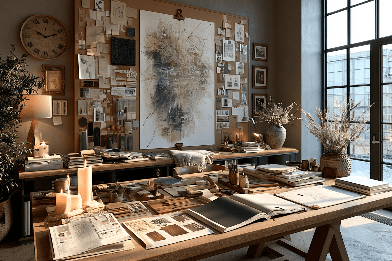
What a single piece can carry
Pick any serious work — a landscape, an abstract, a textile, even a poster you've kept since you were twenty — and look at it analytically for a moment.

You'll find:
- A palette. Usually three to five dominant tones, with one or two accents. This is a complete colour direction.
- A temperature. Warm-leaning or cool-leaning. Earthy, oceanic, sun-bleached, smoky.
- A material suggestion. Brushstrokes imply texture. Flat colour fields suggest minimalism. Photographic detail asks for restraint elsewhere.
- A weight. Heavy, grounded pieces ask for substantial furniture. Light, airy ones tolerate slimmer profiles.
- A mood. Calm, charged, melancholic, joyful. The room will inherit this whether you plan for it or not.
A skilled designer reads these signals the way a musician reads a key signature. Everything that follows in the room becomes a response to what the art is already telling you.
Using art as a moodboard anchor
The moodboard is where this gets practical. In professional practice, a moodboard isn't a Pinterest collage — it's a structured tool for resolving the relationships between colour, material, texture, and mood before a single purchase is made.

When art enters the moodboard early, it does the heavy lifting for you. The palette is no longer an abstract decision; it's pulled directly from the piece. The materials respond to what the art implies. The mood is set, and everything else is a question of supporting it without competing.
In our Moodboard Method course, this is exactly the sequence we teach: start with the anchor pieces — and art is often the strongest possible anchor — then build the palette, material story, and texture decisions around them. It's the difference between assembling a room and composing one.
The shift is significant. Instead of asking "what art goes with this room," you start asking "what room does this art deserve."
The palette question
The most direct way art shapes a room is through colour. Pull three to five tones from the piece — including the quiet background colours, not just the obvious ones — and you have a working palette.
But here's where it gets interesting: the palette isn't a set of equal players. The ratios in the artwork tell you the ratios in the room. If the piece is 70% muted ochre with a 5% deep ultramarine accent, the room should follow that same proportion. Ochre dominates the soft furnishings and walls; ultramarine appears once, deliberately, in a single object.

This is the principle behind every interior that feels considered rather than busy. The art isn't just in the colour scheme — it is the colour scheme, scaled up.
Our Color System course goes deep on how to translate these proportions into a working palette across paint, textiles, hard finishes, and accents. The short version: ratio is more important than hue. Get the ratios right and almost any palette works. Get them wrong and even a beautiful palette will feel chaotic.
Material and texture cues
Art also tells you what materials want to live near it.

A piece with visible brushwork, heavy impasto, or strong texture asks for something to answer it — natural wood, raw linen, unglazed ceramic, wool with depth. A flat, graphic piece prefers smoother surroundings — polished stone, fine weaves, matte paint, clean joinery.
Photography pulls in another direction entirely. A high-detail photographic print asks the rest of the room to step back and provide negative space, so the eye has somewhere to rest before returning to the image.
The mistake most homeowners make is mixing material languages without realising it. A heavily textured oil painting above a glass-and-chrome console will fight every time. The art isn't wrong, the console isn't wrong, but together they're speaking different dialects.
Mood as the final filter
The last thing art carries — and arguably the most important — is mood.

A room inherits the emotional register of its dominant artwork whether you intend it to or not. A melancholy landscape will quietly pull the room toward stillness. A bold abstract will push it toward energy. A delicate botanical study will ask for tenderness in everything around it.
This is why choosing art with intention matters more than choosing it with taste. Taste tells you what you like. Intention tells you what the room needs.
When the mood of the art and the mood you want for the room align, everything downstream becomes easier. The furniture choices narrow themselves. The lighting follows. The accessories almost choose themselves.
A different starting point
If you're approaching a room — a new space, a renovation, or simply a tired interior you want to reset — try this:
Choose the art first. Not the sofa. Not the paint. Not the rug. The art.
Sit with it for a week. Notice what it's asking for. Pull out its palette, its temperature, its material direction. Build the moodboard around it.
![]()
You'll find that the rest of the room essentially designs itself. The decisions become fewer, clearer, and easier to defend. And the finished space will have something most rooms don't: a centre of gravity that everything else is in genuine conversation with.
That's what art in interior design is actually for. Not just decoration. Structure.
Craft'n Build teaches professional design methodology for the design-minded — DIY enthusiasts, working designers, and everyone in between who wants to build real skill rather than copy trends. The Design Key series breaks the discipline into twelve focused courses, including The Moodboard Method and The Color System, both of which go deeper into the principles outlined above.
Share: