Reading Serendipity: What Sherwin-Williams' New Wood Palette Tells Us About the Direction of Warm Neutrals
There is a particular kind of professional skill that doesn't get taught often enough: the ability to read a colour collection. Not to admire it, not to copy it, but to interrogate it — to understand what a manufacturer is signalling, why they're signalling it now, and what it means for the way you specify finishes on your next project.
Sherwin-Williams' Industrial Wood Coatings division released a collection in May 2026 called SERENDIPITY, and it's worth that kind of attention. Not because it's revolutionary — it isn't — but because it's a clean, disciplined articulation of where warm neutral palettes are heading. For anyone working in furniture, cabinetry, or interior architecture, that's useful intelligence. Let's read it properly.
What the collection actually is
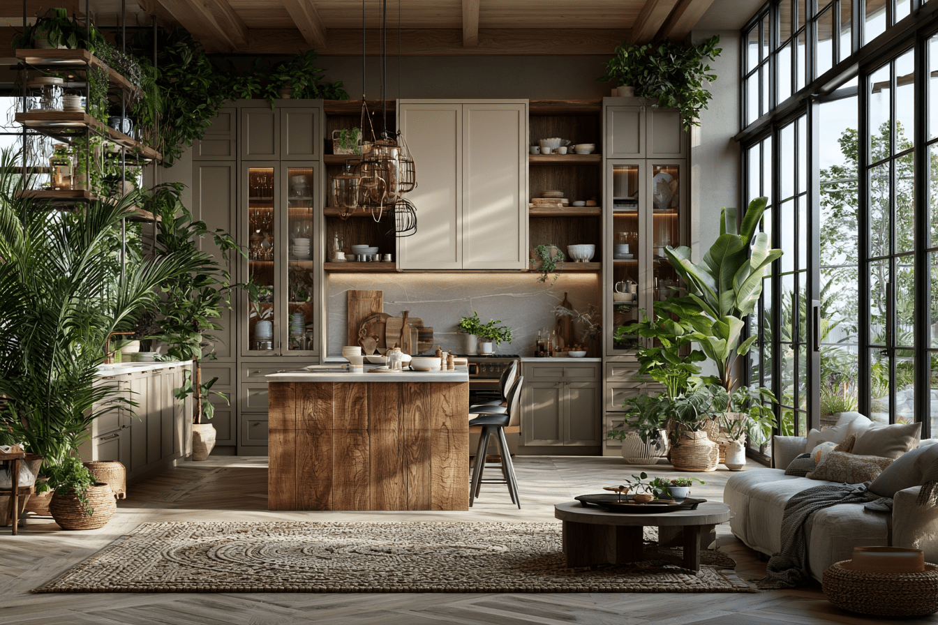
SERENDIPITY is a nine-colour palette built for industrial wood applications: furniture, kitchens, cabinetry, and interior architectural elements. Sherwin-Williams frames it around the idea of the fortuitous discovery — the pleasant find you weren't looking for — and describes the collection as warm, intense, lively yet harmonious, with what they call "delicate balance and emotional depth."
That's the marketing language. Strip it back and here's the substance: this is a tightly edited warm-neutral family, anchored by walnut-adjacent browns and ambered oranges, softened with caramel off-whites. It is not a bold palette. It is a confident one — and those are different things.
Three colours are named explicitly in the release, and they tell you everything about the structure:
- Armagnac (SW 6354) — an aged, ambered orange. The accent.
- Universal Khaki (SW 6150) — a foundational mid-neutral. The connector.
- Cream & Sugar (SW 9507) — a soft caramel off-white. The ground.
If you've worked through The Color System course, this structure will look immediately familiar. It's a textbook application of the accent–connector–ground relationship: one colour that carries emotional weight, one that does the structural work of tying surfaces together, and one that holds the light. The interesting part isn't that Sherwin-Williams used this structure. It's that they led their public communication with exactly three colours out of nine — which is itself a lesson in palette discipline. They showed you the load-bearing trio and let the other six recede. That's how a well-built palette is supposed to behave.

Why warm neutrals, and why now
The instinct, when a major manufacturer releases a palette like this, is to ask whether it's "trend-led." That's the wrong question. The better question is: what underlying conditions is this palette responding to?
Two things are happening at once.
First, the cool-grey cycle that dominated interior wood finishes for roughly a decade has fully exhausted itself. We've watched it happen — grey-washed oak, then greige, then the slow drift back toward genuine warmth. SERENDIPITY isn't starting that drift; it's confirming it has finished. The collection's reliance on walnut tones and ambered oranges is a manufacturer telling the specification market that warmth is now the safe, default position rather than the daring one.
Second — and this matters more for how you actually work — warm neutrals are durable. A palette like Universal Khaki paired with Cream & Sugar isn't built to photograph well for one season. It's built to still look correct in eight years. Sherwin-Williams more or less says this out loud when they describe Universal Khaki as "tailored for timelessness." Read cynically, that's marketing. Read professionally, it's a procurement argument: this is a palette you can specify into a kitchen or a built-in cabinetry run without exposing your client to fast obsolescence.
That's the real signal. SERENDIPITY is a low-risk palette dressed in evocative language. For the working designer, that's not a criticism — it's a recommendation.
The methodology underneath the mood
Here's where it's worth being honest about what a mood board is for, because SERENDIPITY is, in effect, a moodboard that a corporation has published.
Look at the imagery Sherwin-Williams pairs with the collection: terracotta-toned vases on a low timber table, macramé texture against soft drapery, cotton stems in a pale ceramic vessel in raking light. Those images are doing a specific job. They're not decoration. They're establishing the emotional register the colours are meant to operate in — quiet, tactile, unhurried — and they're proving the palette holds together across different materials and light conditions.
This is exactly the distinction The Mood board course draws between an atmosphere board and a specification board. SERENDIPITY's public-facing imagery is an atmosphere board: it sells the feeling. But underneath it, a manufacturer of this scale will have run the specification work — the actual coating chips, the sheen levels, the substrate tests, the way Armagnac shifts under warm versus neutral lighting. The polished release is the visible 10%. The methodology is the 90% you don't see.
That's the point we keep returning to in the Design Key series: a moodboard is not the output of design thinking. It's the evidence of it. When you present a board to a client, you should be able to defend every adjacency — why Armagnac sits next to Universal Khaki rather than against a cooler grey, why Cream & Sugar grounds the composition rather than competing with it. SERENDIPITY can defend those choices. The question worth asking yourself is whether your own boards can.


How to actually use this palette
If you specify wood finishes, here's the professional read on each named colour.
Armagnac (SW 6354) is your accent, and it should be treated like one. An ambered orange of this saturation is not a field colour — it's a focal one. Use it on a single cabinetry element, an island, a feature joinery run, a furniture piece meant to anchor a room. The mistake to avoid is democratising it across every surface; intensity loses its meaning when it's everywhere. Specified sparingly, Armagnac does what an accent is supposed to do — it gives the eye a place to land.
Universal Khaki (SW 6150) is the most genuinely useful colour in the collection, and the least exciting, which is usually how it goes. As a mid-neutral it connects warmer and cooler elements without forcing a decision. It's the colour you reach for when a scheme needs a surface that resolves tension rather than creating it. In a kitchen, it's a credible choice for the bulk of the cabinetry, letting Armagnac carry the accent and Cream & Sugar carry the light.
Cream & Sugar (SW 9507) is your ground. A caramel-leaning off-white reads as soft rather than clinical, which is precisely why it works against warm woods — a true cool white would fight the palette. Use it where you need the composition to breathe: upper cabinetry, trim, the surfaces that should recede so the accent can advance.
The composition logic here is one we teach directly: let the ground hold the light, let the connector hold the structure, let the accent hold the attention. SERENDIPITY is, in a sense, a manufacturer publishing a worked example of that principle. You can specify straight from it — or, better, you can understand why it works and build your own variant for the specific brief in front of you.

The honest assessment
SERENDIPITY is a well-built palette. It is also a deliberately safe one, and you should specify it knowing that. It will not surprise anyone — despite the name — and it won't date quickly either. For a great many briefs, that's exactly the right trade.
What it offers the working professional is less a set of colours than a confirmation: warm neutrals are now the stable centre of the wood-finish market, not its frontier. If you've been hesitating to move a client away from cool greys, this is one more manufacturer telling you the ground has already shifted.
But notice the deeper lesson. Sherwin-Williams didn't just release nine colours — they released a structure, a mood, and a rationale, all aligned. The accent is defensible. The connector does real work. The ground is chosen to serve the wood, not to assert itself. That coherence is the actual product. The colours are almost incidental.
That's the skill worth building. Anyone can pick three pleasant colours. Far fewer can explain why those three, in that relationship, for that brief — and then defend it to a client who pushes back. That ability is what separates a finish selection from a finish specification, and it's the throughline of everything in the Design Key series: The Mood board for the method and the intent, The Color System for the applied theory that makes the intent hold up under scrutiny.
Serendipity, as a word, means the fortuitous discovery. But the discoveries that matter in this work aren't fortuitous at all. They're the result of looking deeply, structuring carefully, and knowing exactly why the thing in front of you works.
That's not chance. That's method.
The Color System and The Moodboard are part of The Design Key — Craft'n Build's interior design master programme. Each course is available standalone, and standalone progress stacks toward the full programme.
Share:
Benjamin Moore Silhouette: 2026 Color of the Year – Curating the Perfect Color Palette for Modern Living